Timing is Everything: Inside Perplexity's Growth Engine Playbook
How Perplexity engineers its user activation.
I think there's always a market for an app that makes its users feel powerful.
Canva makes me feel like a magician just because I don't have proper design skill.
Notion makes me feel like I am a builder and productivity master. I can build blocks from scratch that eventually become a mini-app that tracks my to-do list.
Recently, Replit makes me feel like I can build software. I no longer feel like I'm just an idea guy, I'm a full stack engineer.
Speaking of powerful tools, there's Google - the OG of search engines that's been doing basically the same thing for over 20 years. Nothing makes me feel powerful or extraordinary there. It's just a search engine, after all.
Then AI crashed the search party and flipped everything upside down. All of a sudden, search engines weren't just throwing links at us - they were actually getting what we're asking, connecting pieces from everywhere, and serving up answers right back at us.
Those ten blue links on Google Search Result Page starts to feel outdated as I found something more interesting…
Enter Perplexity
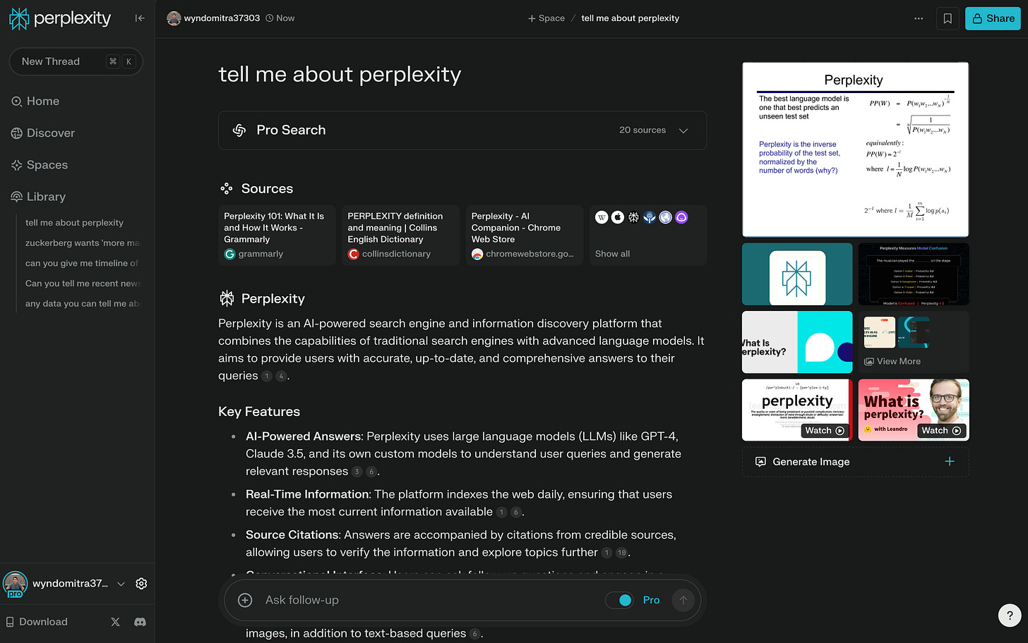
The first time I used Perplexity, I was blown away. It felt like having a conversation with a super-smart friend who can summarize everything for me and remember it all. If I don't trust it, it gives me citation links to explore and lets me figure it out myself.
Just like Google, but better.
Let me share three things that got me hooked:
Speed: Getting answers instantly, not just links to dig through
Smarts: It actually gets what I'm asking
Sources: Shows me exactly where the info comes from, so I can double-check anything suspicious
These three things create that "powerful" feeling I mentioned earlier - just like Canva makes me feel like a design pro.
The next thing I know, I'm already a pro user and buried deep in Perplexity's rabbit hole searching for my current obsession about AI.
In fact, Perplexity is one of those AI apps that's not just playing around. They're taking aim at the sleeping dragon (yes, I'm looking at you, Google).
Their approach is clearly working. In just a short time, Perplexity has:
Grown their B2B market share by +21% in early 2024
Valued at $9B and attracted over 90M+ monthly visits (as of December 2024 data by SimilarWeb)
Served over 400 million search queries every month - up from 250 million queries in July 2024
These numbers got me thinking - how did Perplexity grow so fast? What makes their user experience, especially their user activation, so great? I mean, what made me pull out my wallet and become a pro user in the first place?
As Elena Verna notes:
"In a product-led growth (PLG) strategy, the product is the primary driver of customer acquisition, activation, engagement, and monetization."
This perfectly describes Perplexity's approach.
Let's break down each stage to understand how Perplexity builds this powerful product-led growth engine:
Getting users to experience value instantly
Converting that value into user signups
Upgrading free users to pro subscribers
Quick note: To keep this focused, we'll ignore any Perplexity features that don't directly relate to their search function. Trust me, it'll make more sense this way.
Let's dive in!
1. Getting users to experience value instantly
Not every app can replicate Perplexity's business model. But here's something cool: you can search anything the moment you open their app or website. No signup required.
It's permission-less!
This aligns perfectly with PLG fundamental element in user onboarding:
The job of user onboarding is to rapidly reduces Time to Value (TTV).
Perplexity nails this!
In fact, Raman Malik, Head of Growth at Perplexity, emphasizes that "getting a user to perform three queries in their first session" is their key activation metric, indicating that users truly understand the value of the platform. They prioritize this early activation and retention over aggressive acquisition, believing it's critical for long-term growth.
First, let's talk about Perplexity's real value proposition: getting answers like you're chatting with your super-smart friend. And yeah, it has to be better than Google.
Here's how they make it happen:
Manual search
Search using recommended and dynamic queries
While you can type any search query like Google, Perplexity goes a step further with their dynamic query system. These are not just random suggestion boxes. These engineered queries make getting value from the platform dead simple.
Here's what makes their dynamic queries so powerful:
They tap into trending topics and high-performing searches, ensuring you're getting relevant and trendy suggestions
The homepage refreshes with different queries each time, keeping the experience fresh to encourage exploration
It removes the "blank page paralysis" new users often face - instead of staring at an empty search box, you're immediately prompted with interesting questions to explore
The smart query system guides new users through Perplexity's capabilities, eliminating the initial search paralysis. It's a subtle yet powerful way to smooth the user onboarding.
The growth engine doesn’t stop there.
At the bottom of each result page, suggested queries invite you to dig deeper into your current topic. This helps satisfy your curiosity.
Notice how similar Perplexity's and Google's user journeys are when it comes to encouraging further searches?
This design captures your attention and encourages more searching. The deeper you go down this rabbit hole, the more likely you are to stick around.
And that's exactly when Perplexity makes their next move...
2. Converting value into user signups
Now you are hooked!
You start enjoying yourself getting answers from Perplexity.
You keep querying.
But… 🤔
After your second search, Perplexity strategically introduces its sign-up prompts as Raman Malik mentioned on the early section of this post, but the experience varies by platform:
Mobile Web: Full-screen signup prompt after 3 searches
Desktop Web: Half-screen prompt after 3 searches, escalating to full-screen by search #5
Mobile App: No signup prompts at all
⁉️ This platform-specific approach reveals both clever strategy and missed opportunities:
Sign-up prompts only show up on the web version, not in the app. My hunch is this is because most users don't convert on web, but are more likely to convert in the app. To improve the experience, the Perplexity team hasn't implemented this feature in the app. Assuming they've tested this approach, I won't question their decision.
However, the sign-up prompts fall short in one crucial aspect: they don't communicate value. When the signup screen appears, it simply asks users to create an account without explaining the benefits. A simple addition like "Sign up to save your searches and get personalized recommendations" could significantly boost conversion rates.
Anyway, after signing up, Perplexity smoothly transitions users toward their ultimate goal: converting free users into pro subscribers.
3. Upgrading free users to pro subscribers
As part of welcoming new signed-in users, you’ll run through the four carousels explaining its main core messaging and features.
The main objective of these carousels are to emphasize what Perplexity is, upsell users into pro plan, and install the app. After all, users who actively engage with the app stay. Eventually, it will drive their retention rate.
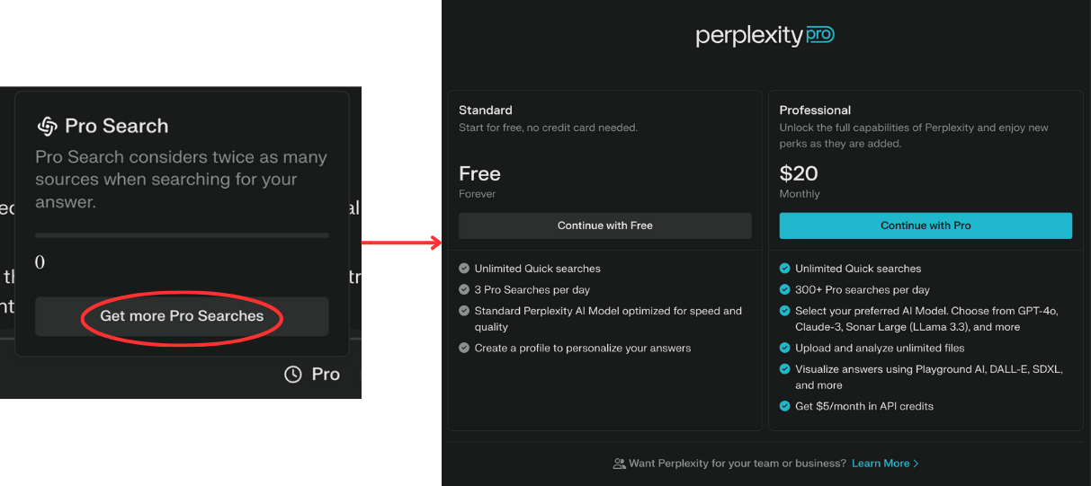
Now, as a new signed-in user, you have a new superpower: pro search.
Key features in pro search:
More in-depth analysis by analyzing twice as many sources compare to non pro
Select preferred AI model (Claude, ChatGPT, Llama, and more)
Visualize answer
And more…
Unfortunately, you only have this superpower for 3 searches in a day.
And they make it clear right here.
Web version
Mobile app version
It's a clever psychological play: give users a taste of something powerful, but limit it just enough to create that "I need more" feeling.
The kicker? Once you've experienced better search, going back to basic feels like a downgrade. We humans hate losing things more than we enjoy gaining them. And Perplexity knows this well.
Once it runs out, the pro plan toggle changes and directs users to the pricing page.
This is how Perplexity turns its free users into paid customers.
By following this whole journey, you'll understand how Perplexity engineer everything to upgrade you to become a pro user.
As Bandan Jot Singh emphasizes on his post:
"At the heart of any successful product-led growth story is the belief that end user success will result in the company's success. This belief must be shared by every team in the business."
Perplexity embodies this in their approach.
🔑 Key takeaway
Perplexity's growth playbook is not about having better features than Google. It's about making users feel like they are well-informed by synthesizing multiple sources into clear, actionable summaries.
Here are key highlights of what makes it work:
1. Zero friction start
By letting users jump right in without signing up, Perplexity removes all barriers to experiencing their value proposition. It's like letting someone test drive a Tesla without even asking for their license. You know once they feel that acceleration, they're hooked.
2. Strategic limitations
The freemium model works perfectly with Perplexity's instant-value proposition. It gives new users a taste of the premium experience while letting them decide if they want to commit and upgrade. The three daily pro searches are just enough to show users what they're missing.
3. Continuous value delivery
From dynamic queries to suggested follow-ups, every feature is designed to keep users learning new ways to use the platform. It's a perpetual "aha moment" machine that drives engagement every damn time.
📙 Playbook for you
Looking at Perplexity's success, here are key principles you can apply to your own product:
1. Rethink your product demo
Instead of explaining your product's value, let users experience it immediately. If you currently require signup before any value delivery, ask yourself:
"What's the smallest slice of our product we can offer without friction?"
2. Map your power moments
Identify where in your user journey people feel most capable and confident. These are emotional peaks that drive engagement and retention. Build your upgrade prompts around these moments.
3. Design for discovery
Perplexity's dynamic queries show that sometimes the best UX is not about reducing clicks - it's about guiding users to discover value naturally. They achieve this by strategically placing relevant queries that tap into users' curiosity and remove the "blank page paralysis," making complex searches feel like a conversation.
What makes Perplexity's growth engine particularly impressive is how they've engineered each step of the user journey to build sustained engagement. They're building a conversion machine that turns casual users into pro. They are writing a new playbook for user activation in the AI era. Whether you're building the next search engine or an entirely different product, the principles behind Perplexity's growth engine offer a masterclass in modern user activation strategy.
And in the end, isn't that what great products do? They don't just solve problems, they transform experiences.


Thanks for sharing! Love the insight about leveraging those power moments 💪
Well written article and very informative.