

How Top Tech Products Hook Their Users From Day One
Whether you are selling vegetables or software, this strategy works!


Have you ever wondered how the most addictive products feel so intuitive? As if they guide us step by step until our lives depend on them?
It doesn't happen by chance. In fact, it's carefully engineered.
The best products follow a playbook that works for everything from vegetables to software. Yes, you read this right!
Take the Farmer's Market with key vendors positioned right at the entrance.

These "anchor vendors" aren't randomly placed—they strategically pull us through the entire market. In just a few minutes walking past the entrance, you suddenly realize you're holding bags of snacks, chocolates, pastries, and other items you didn't think you'd need. That's not an accident - that's brilliant design.
Onboarding > Core > Discovery
This mirrors what happens in user onboarding or first-time user experience (FTUE). The truth? FTUE first highlights core features that deliver immediate value—solving the problem that made users download your app. Then it gradually introduces specialized "nice-to-have" and power features that improve the experience once users are hooked on the basics as a part of Discovery Phase.

Whether you're tech founders, product managers or designers, it's your job to identify and create a map that encourages users to experience your product's core value and explore further.
Let's take a look at how major tech companies execute this playbook:
1. Spotify
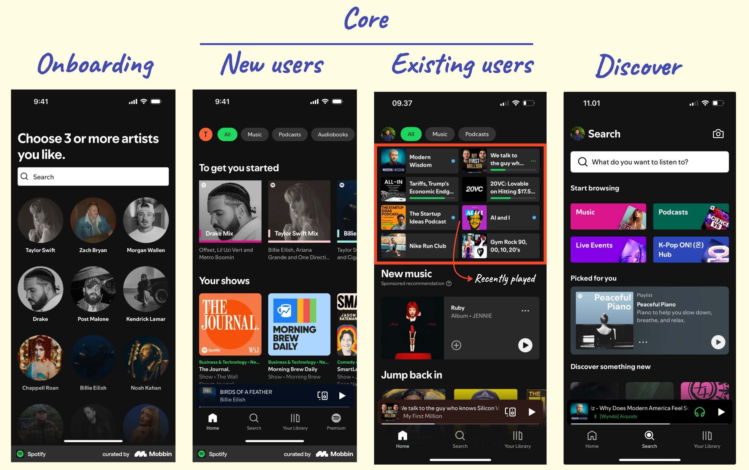
Onboarding
Spotify has a simple but strategically brilliant onboarding. You only select a few artists and podcasts, allowing the app to create personalized content before introducing features like Blend, Playlist, and Liked. They don't overwhelm you with additional features that you still don't need to understand.
That's deliberate - they want you experiencing music and podcast first, features second. This approach effectively solves the "blank slate" problem that causes app abandonment. By collecting just enough preference data, they ensure your first experience feels tailored rather than generic to create an instant emotional connection with minimal effort.
Core
Spotify's core value is dead simple: play music and podcasts. The home screen delivers a personalized mix based on your onboarding preference, but with a clever twist - as you use the app more, it prominently displays recently played items at the top. This creates a powerful habit loop: you open the app, see what you were just enjoying, and can instantly pick up where you left off with zero friction.
This recent plays section is actually a brilliant retention hook. Most users come back to continue something they were enjoying rather than to discover something new. By making reengagement easier to access, Spotify removes the "decision fatigue" that often leads users to abandon apps that constantly demand new choices.
Discovery
As you scroll down the home page, you'll find specialized content - genre-specific playlists, mood collections, and artist spotlights. "Discover Weekly" and "Release Radar" function as gateway drugs, introducing content that feels personal but pushes you to explore Spotify's vast library. Spotify strategically delays features like Blend, Playlist creation, and Liked Songs until after you've experienced the core value. They know collaborative features only become valuable once you understand what the app does for you personally.
2. Instagram

Onboarding
Instagram tackles the "blank feed problem" with a two-step approach: first connecting you to Facebook friends, then suggesting accounts based on their algorithm, including celebrities. This is a critical retention strategy because new users who see an empty feed are likely to abandon the app immediately.
Have you noticed that Collections and Instagram Shopping are completely hidden during FTUE? That's because Instagram knows these features would overwhelm new users before they've experienced the core photo-sharing value. Instagram holds back these secondary features until you're already hooked on the basics.
Core
The feed and story carousel dominate the entry point, with the post button centered in the bottom navigation. This placement tells you exactly what Instagram wants new users to do: either consume visual content or create their own photos/videos and stories.
This creates a powerful engagement loop where viewing content naturally inspires you to create posts, which then feeds back into the content ecosystem for others to consume. Before you know it, you're checking the app four hours everyday.
Discovery
The Explore tab functions as Instagram's dedicated discovery zone that users can visit, while the algorithm gradually and subtly introduces new content types (Reels, Shopping) within the main feed based on your specific engagement patterns.
As you become a regular user, you'll notice Instagram starts introducing accounts you might like directly in your main feed. It's no longer just about what you follow, but what might interest you based on your behavior. This is exactly the same psychological technique Spotify uses with its Discover feature - gradually expanding your content universe while maintaining the familiar interface you've come to rely on.
This principle of progressive discovery applies across all major social platforms like X, TikTok, and LinkedIn.
3. Notion

Onboarding
To get you onboard fast, Notion mainly only asks you about what you want to use Notion for, whether it's creating a habit tracker, travel plan, or project management. This approach is brilliant because instead of boring you with lengthy tutorials about their complex features, they show you the end result first. By presenting templates that match your needs, they create an immediate "aha moment" where you can visualize solving your specific problem.
Notice how Notion skips explaining their database structure or block system during onboarding? They know that explaining these technical concepts would create friction. Instead, they let you immediately interact with a fully-built template that feels valuable from the first click.
Core
The core experience of Notion centers around building and visiting pages. At its most fundamental level, they want you to create something - anything - that organizes your thoughts or work. That's why the main interface simply shows you pages you've created and makes it easy to create new ones.
What's clever here is that new users don't need to understand what databases, tables, automation or specialized blocks are at this stage. This prevents the "feature paralysis" that plagues many productivity tools that bombard new users with all capabilities at once.
Discovery
Once new users get hooked with template projects/pages, they develop curiosity about building their own solutions - the perfect psychological moment when Notion unveils its power features. As users customize templates or create from scratch, they learn about databases, relations, and formulas exactly when needed. Notion's genius is letting this discovery happen naturally through exploration: make a custom table and suddenly you're learning databases; link information between pages and you learn relations. Each advanced feature is encountered precisely when needed, making complex concepts immediately useful rather than confusing.
This gradual unveiling of power features is why Notion users evolve from casual note-takers to power users who build entire work systems - all without ever feeling overwhelmed by the learning curve.
Key takeaway for product team
So what can we learn from these tech giants? They've mastered the art of progressive disclosure - revealing features at precisely the right moment in the user journey. Their success isn't accidental but follows clear patterns we can adapt.
When building your next product, consider these actionable takeaways:
1. Map your value discovery journey
Create a visual flow of how users should discover features, from core value to advanced features. Identify specific triggers that indicate a user is ready to progress to more complex features (time-based, usage-based, or behavior-based).
2. Create feature importance matrix
Plot features on a quadrant based on:
Ease of understanding (x-axis)
Core value delivery (y-axis)
Features in the "high value, easy to understand" quadrant become your "anchor vendors."
3. Create FTUE metrics
Beyond general retention, create specific FTUE metrics:
Feature discovery rate (% of users who find each feature)
Time-to-value (how quickly users reach their first success moment)
Progressive engagement (do users advance to more complex features over time?)
The real magic? None of this is accidental. Just like those farmers market layouts, these product flows are engineered to pull you deeper with each interaction.
So next time you're building a product, think like a market designer. Place your "anchor features" strategically, create clear paths to value, and watch as users naturally discover everything your product has to offer. That's how you make your hooked in the first place.